
The Journal · Finishes
Brass, Copper, Black or Graphite? Choosing the Right Kitchen Hardware Finish
The finish you choose for your handles and taps sets the entire mood of a kitchen. Here's how to pick one you'll still love in ten years.
Of all the small decisions in a kitchen, the finish of your hardware is the one people agonise over most — and rightly so. It's the colour your eye returns to, the tone that ties the room together, the detail guests notice without quite knowing why. Get it right and everything looks considered. Get it wrong and even an expensive kitchen feels slightly off.
The good news is that choosing well isn't about chasing trends. It's about understanding how each finish behaves — in the light, against your worktop, and over years of daily use. Here's a plain guide to the four finishes that anchor most beautiful kitchens.
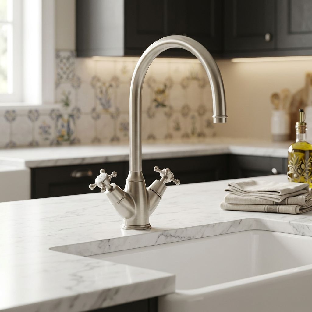
1. Brass: warmth and character
Brass is the finish that makes a kitchen feel collected rather than bought. Its golden warmth flatters wood, marble and painted cabinetry alike, and a softer, aged-look brass — as opposed to bright, shiny gold — wears beautifully over time rather than dating. It looks better with age, the way a good leather bag does.
Brass suits warm and traditional palettes especially well — sage greens, creams, natural oak, deep navies. If you want a kitchen that feels timeless and a little characterful, this is usually the answer.
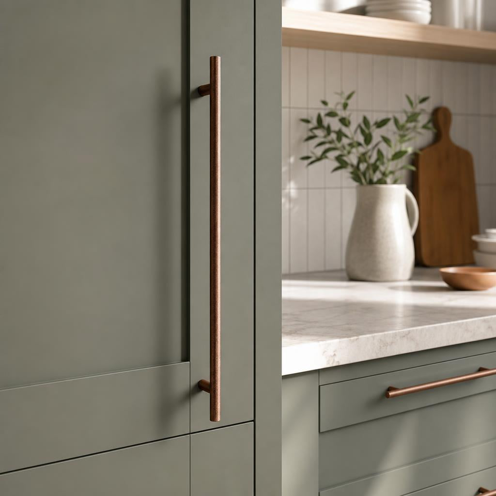
2. Copper: rich and full of personality
Copper is for the kitchen that wants a little warmth and a lot of character. Deeper and pinker than brass, it brings a glow that feels both rustic and refined depending on what surrounds it. Against dark cabinetry it's dramatic; against pale, natural materials it's soft and inviting.
It's the most distinctive of the four, so it rewards confidence — but in the right room, nothing else looks quite like it.
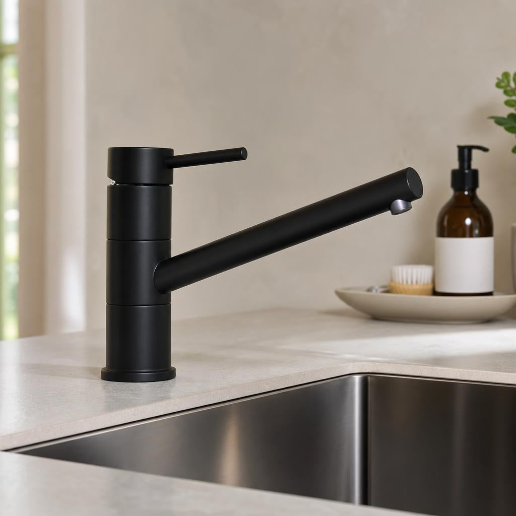
3. Black: clean and contemporary
Matt black is the modern default for good reason. It's crisp, versatile and endlessly easy to live with, giving clean definition against white and light kitchens and a sleek, tonal look against darker ones. It's the safe-but-stylish choice — hard to get wrong, and quietly current.
Black coordinates effortlessly with stainless appliances and contemporary worktops, which is why it's become the go-to for new and renovated kitchens alike.
4. Graphite: architectural and soft
If black feels a touch too stark, graphite is its subtler cousin — a deep, soft, gunmetal grey that reads as architectural rather than bold. It brings weight and sophistication without the high contrast of true black, and pairs beautifully with pale stone, concrete-look surfaces and minimalist, handleless-style kitchens.
The best finish isn't the most fashionable one. It's the one that still feels right when the trend has passed.
How to choose: a few honest rules
Start here
- Match the undertone of your worktop — warm stone loves brass and copper, cool greys love black and graphite
- Pick up an existing metal in the room — light fittings, a radiator, window furniture
- Order physical samples before committing — screens lie about metal
Avoid
- Mixing more than two finishes in one room
- Bright, shiny finishes in high-use spots — they date faster
- Matching the tap to the appliances — coordinate it with the handles instead
Can you mix finishes in a kitchen?
Yes — carefully. The designer trick is to choose one finish as your lead (usually the handles, since there are most of them) and one as an accent (often the tap). Two finishes that share a tone — say, brass with black, or copper with graphite — read as deliberate. Three or more tends to read as accidental. When in doubt, coordinate rather than match: a tap and handles in the same finish always look intentional.
Frequently asked questions
What is the most timeless kitchen hardware finish?
Brass and black are the two most enduring choices. Brass has been used for over a century and ages gracefully rather than dating, while matt black is clean, versatile and easy to live with. Both suit a wide range of cabinet colours.
Should my kitchen tap match my cabinet handles?
They should coordinate, not necessarily match exactly. Choosing the tap and handles in the same finish — for example both in brass, or both in black — gives a pulled-together look. A close match reads as considered; a clash reads as accidental.
Is brass or black better for a kitchen?
Neither is better — it depends on your style. Brass and copper bring warmth and character and suit traditional or warm-toned kitchens. Black and graphite are cleaner and more contemporary, and suit modern or cool-toned schemes. Match the finish to your worktop's undertone and you can't go far wrong.
What finish goes best with a white kitchen?
All four work, but to different effect. Black and graphite give crisp, modern contrast; brass adds warmth and a softer, more classic feel; copper makes a bolder statement. For a white kitchen you want to feel current, black is the easy choice; for one you want to feel warm, brass is.
Whichever finish you land on, our collections run across handles, taps and sinks in coordinated finishes — so the whole room speaks the same language. Explore the Sink & Son collections.
Leave a comment
This site is protected by hCaptcha and the hCaptcha Privacy Policy and Terms of Service apply.